2004 Election County-By-County

The famous Red and Blue county map is back. I was wondering if we’d see another one of these:


USATODAY.com

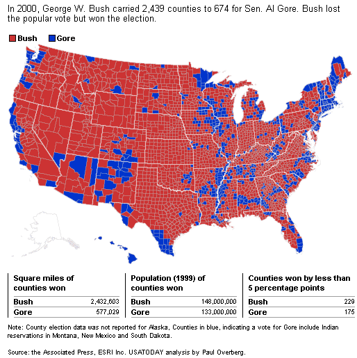
This compares interestingly with the famous 2000 map:


USA Today

Hat tip: Michelle Malkin

See also this interesting discussion with Brad DeLong that I had in July 2003 over the degree to which the “red-blue” map should really be “purple.”

[Note: I’m periodically updating this post with the latest version of the USA Today map. There are still some gray counties; ultimately, I’d like to have the “final” map here.]

Update (11/9): What appears to be the final version–no more gray counties–is up now.

FILED UNDER: 2004 Election, , ,
James Joyner
About James Joyner
James Joyner is Professor and Department Head of Security Studies at Marine Corps University's Command and Staff College. He's a former Army officer and Desert Storm veteran. Views expressed here are his own. Follow James on Twitter @DrJJoyner.

Comments

  1. willycrash- says:

    its more fun to lay a map of the slave states of 1860 over the state by state bush wins. dead ringer. god damn I thought i’d never get to see the south rise again, but I was wrong. long live the confederacy!

  2. David Hecht says:

    “its more fun to lay a map of the slave states of 1860 over the state by state bush wins. dead ringer.”

    Ah yes…like the well-known slave states of Ohio, Indiana, Iowa, Kansas, Nebraska…

    Always nice to read a post by someone with a “gude eddickashun”.

  3. Jamie Cannon says:

    Two wonderful maps that tell you more about this country that twenty talking heads. If the Democrats are wise, it also suggests the dircetion they must go if they want to avoid becoming the permanent minority party. That is to say that this country is still a reliious country where faith matters. If you are a politician, ignore this at your peril except in a few isolated places. Vermont and San Francisco come to mind.

  4. Thomas Linken says:

    “Slave States” ? Give me a break. The Democrats were the party of segregation. But then again, they’re also the Party of self-delusion and historical amnesia. Sleep tight.

  5. Amin Badie says:

    This is a case of factual data producing misleading graphics. The map does not reflect the fact that the counties voting for Bush are more rural and have a lower population density. It gives the impression of the country being mostly republican, when in fact it is evenly devided. These maps will only be useful if we calculated votes per square mile, rather than per person.

  6. Don Gouge says:

    The genius of the Electoral College system is that the large population centers cannot dominate the country. The voice of the rural states can also be heard and have a voice. This map shows that without our system, we would have a tyranny of the metropolis. We all have a voice. I hope to hear no more about getting rid of the Electoral College!

    PS: Viva Bush!

  7. Obsidian says:

    Here’s another take on the county maps that tries to show the % vote and population density as well…

    http://obsidianorder.blogspot.com/2004/11/red-and-blue-reprise-2004.html

  8. Jeebus says:

    James,

    Did you fiddle with the sq. miles in the 2004 map? How is it possible that BOTH Kerry and Bush increased their total sq. miles? Did we finally incorporate Canada when I wasn’t paying attention?

    Me.

  9. cy oster says:

    I still cannot figure out the total county count for red vs. blue. Can you help?

  10. Ellen says:

    USA Today has now fixed the area figures. It should have read 2.28 here.

  11. After Forever says:

    I really would like to see the crime rate displayed county by county against the 2004 election results county by county.

  12. IlliniGuy says:

    Seeing how the left advocates economic slavery, maybe we should let the kerryites establish their own Confederation of Blue States. Anybody willing to exchange the fiscal policies of Massachusetts with those of Texas?

    BTW, WillyCrash, can’t you on the left post anything without swearing?

  13. Allan says:

    Why the vote numbers went up for Bush but the map remained the same is easy to understand when you look at the population figures: between 2000 and 2004, more people moved out of the blue zone than moved in. These voters reinforced the “red zone” with fewer “iffy” counties for either side.

    You can also see where the righties moved to and where the lefties prefer to go: compare Arizona and Utah with Vermont or Maine.

  14. Bill Murphy says:

    Maybe it’s time to try dividing the country again. Good riddance to the West Coast and the Northeast – I have had it with those good for nothing Yankees. They can have the Republic of Sodom on the west and the Republic of Gomorrah on the east and to hell with all of them.

  15. Col. Jesup says:

    Ah, so nice to bask in the warmth of true Christian love.

    Hypocrites.

  16. Robert Schneider says:

    Where can an individual buy a copy of the county by county map, just like the one shown on this web site….??….tks Bob S.

  17. TerryO says:

    I recommend that we do an exchange program with Canada. We will trade all the people that no longer want to live in the United States under George W. Bush, for all the Canadians that are sick and tired of their Government’s confiscatory, socialist policies.

  18. shockwaver says:

    A 2000 –> 2004 comparison shows blue counties at the margin are flipping to red. Blue lights are going out one by one. If the philippic against Bush continues, the next few years will bring a few more Republican Senate and House seats, another Republican president and a redder map.

    I like a 2-party system. Why don’t the Democrats get the venom out of their system, move to the middle and compete instead of self-destructing?

  19. lt. kaffee says:

    Cartograms may be a bit more fair and balanced that is if we’re looking at the actual number of votes instead of votes per acre. I was just looking at http://www-personal.umich.edu/~mejn/election/

    Anyway, we’re more purple than clearcut red and blue.

    —————————–

    I have wondered at times what the Ten Commandments would have looked like if Moses had run them through the U.S. Congress.
    — Ronald Reagan

  20. LisaW says:

    As long as the Democrat Congressional leaders (a la Nancy Pelosi) continue to make venomous, divisive comments, the possibility of political healing will be impossible. To the Dems: you lost, big time, get over it and get on with the work of the country.

  21. Frank says:

    How nice to see this country is populated with smart people. Coming from New york area, you only see one side of the issues, which are usually lies by the media, entertainment people, and liberals that don’t believe in the American Way. Most American people have got common sense with seems to be lost by the Left. The MAP shows the truth !!!! GO BUSH, the Senate, the House, and soon to be appointed 5 Supremme court Justices

  22. christina says:

    wow give them 2% and they think they own the country. keep deluding yourselfs righties.

    i also have an exchange program idea – why don’t everyone who supports bush and his iraq war raise your hand. and every service person in iraq who wants to go home raise your hand – we can do the switch from there and get rid of the jerks in this country.

  23. Pete says:

    Don’t worry, Christina, once Bush appoints some new Supreme Court justices, we’ll see who’s deluded! You don’t know squat about the service men in Iraq because people like you hate the military. They have a job to do and they’re doing it.

  24. Maj. Dave says:

    Christina, we are fighting for your right to criticize our system, our Commander in Chief, our predominate religions and yes even us (The Military – my hand went up volunteering to fight, the folks supporting our mission did not. Grasp the concept.) Try that with the Wahabists Muslim community dedicated to our downfall and see how long your non-voting, non-driving, not educated burka covered body remains intact and not bloodstained.