Bad Graphs Mislead More Than 1000 Words
A case study in how one's choice of graphing techniques can shape a debate over known data.
Following Alexander Hart‘s lead, Ezra Klein accuses Republicans of “some serious chart based chicanery” for the inclusion of this graph in the “Pledge.”
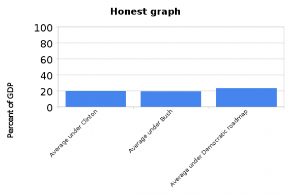
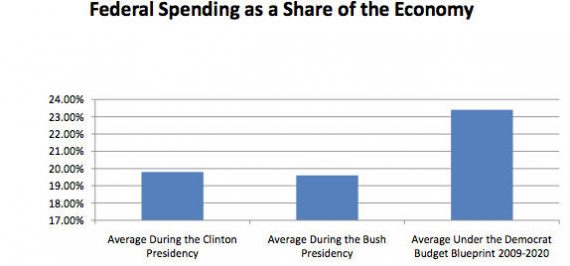 Both note that the actual variance is being distorted by starting the Y axis at 17%, making the increase to 23.5% seem massive. Hart produces this “honest graph.”
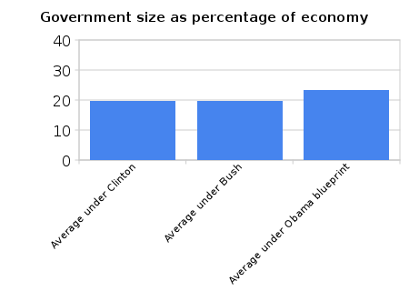
But, as Klein’s readers point out, this chart is actually more misleading! Taking the axis up to 100%, when the actual top number is only 24%, totally minimizes the variation. So he dutifully comes up with a compromise chart:
Jonathan Bernstein, who desperately wants more people to read him — and they should! — gives this Catch of the Day honors.
My initial reaction to all this was that it just shows how distorting random — and honest — choices in graphical design can be. And also that, while starting a chart at 17% to magnify the difference may not be entirely kosher, it’s such a standard practice in these things as to not be noteworthy. But those observations are too banal to merit the time needed to produce such a graphically-intensive post.
But Andrew Gelman actually makes a more substantive point:
I agree with Klein and Hart that, if you’re gonna do a bar chart, you want the bars to go down to 0. On the other hand, a projected change from 19% to 23% is actually pretty big, and I don’t see the point of using a graphical display that hides it.
The solution: Ditch the bar graph entirely and replace it by a lineplot, in particular, a time series with year-by-year data. The time series would have several advantages:
1. Data are placed in context. You’d see every year, instead of discrete averages, and you’d get to see the changes in the context of year-to-year variation.
2. With the time series, you can use whatever y-axis works with the data. No need to go to zero.
I agree that a line plot, or even a simple line graph, would be more useful than a bar graph here. But all statistical graphs have advantages and disadvantages.
Further, in defense of whomever drew the disputed GOP chart that started this whole thing, Bernstein commenter David Tomlin correctly observes, “Federal spending as percent of GDP hasn’t been below 17% since before WW2. Looking at the range between 17% and 24% seems to me to be a perfectly reasonable way of comparing changes in that figure. Describing the clearly labeled graph as ‘dishonest’ is tendentious.”




The problem with Mr. Klein’s complaint and everyone else’s is that they ignore how a bar graph is built. I was taught in stat class that bar graphs consider the highest and lowest values of the data set being presented. Graphing it versus 100% is incorrect because it blows out detail, but of course shows “perspective,” as the Lefties say.
Given three data points with such minmal variance, actually, the first graph is correct, just as commenter Tomlin says.
I think the works of Edward Tufte should be required reading for all journalists–including bloggers. I wouldn’t object to their being made required reading before people could get their drivers licenses, for that matter.
http://www.edwardtufte.com/tufte/
Yeah, all graphs are misleading in a sense… even the best Tufte approved graphical masterpiece is meant to highlight a certain aspect of the data and present in such a way as to tell a story. The numbers and stats tell you everything you need to know, and everyone should approach every graph they see as a skeptic.
“Given three data points with such minmal variance, actually, the first graph is correct, just as commenter Tomlin says.”
Nope, graphs are a visual aid. That first graph gives the visual impression of a doubling. If you choose to use such a graph, there should be a disclaimer. However, since most people are not mathematicians, they will still walk away with a misleading impression. You are close. What you should really do is start at zero, but use increments of about 1% on the Y-axis as was done on the original graph (I am too lazy to calculate what the actual increments should be to correlate with the actual change.)
Of course, without a time frame, this graph wold still be incomplete. Does this include the stimulus? It also ignores the composition of that spending. How much of it is discretionary vs entitlements? I like graphs a lot and use them in my own writing, but I always go back to the original data when I can. People often cherry pick data to get the results they want, which shows up when you go back to look at the original numbers. You also need to remember to correct for things like inflation to get accurate data, though nominal numbers are still important.
Steve
The last graph of the 3 is obviously most honest.
“Given three data points with such minmal variance, actually, the first graph is correct, just as commenter Tomlin says.”
One wonders where you went to school. I agree topping it out at 100 disorts but this chart should baseline at zero. As one of the commenters points out it’s hardly worth talking about since this sort of sleight of hand is standard operating practice in this sort of doc.
The other thing the Republicans ignore is that much of the spending in the 2009-2020 period was contracted on the GOP watch.
I agree with regard to Graph #3 being the most reasonable. However, even that one is problematic in portraying what is supposed to be portrayed (Obama’s “irresponsible spending”). As a percentage of the GDP, the GDP is important. Obama could have cut spending and could still look “worse” on this graph because the GDP likely got cut by more.