Charts Are Persuasive!
Justin Wolfers of The New York Times’ Upshot blog passing along a study that demonstrates just how persuasive presenting information in a visual format can be:
[T]wo Cornell researchers, Brian Wansinkand Aner Tal, ran a small online survey to assess whether alternative descriptions of the same information were more persuasive. Each respondent read the following description of a mythical drug trial:
“A large pharmaceutical company has recently developed a new drug to boost peoples’ immune function. It reports that trials it conducted demonstrated a drop of 40 percent (from 87 to 47 percent) in occurrence of the common cold. It intends to market the new drug as soon as next winter, following F.D.A. approval.”
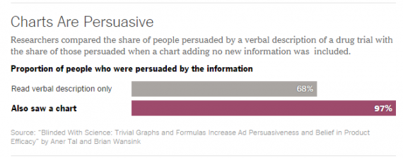
When this was the only information given, 68 percent believed that the medication really did reduce illness.
Then for a randomly selected subsample, the researchers supplemented the description of the drug trial with a simple chart. But here’s the kicker: That chart contained no new information; it simply repeated the information in the original vignette, with a tall bar illustrating that 87 percent of the control group had the illness, and a shorter bar showing that that number fell to 47 percent for those who took the drug.
But taking the same information and also showing it as a chart made it enormously more persuasive, raising the proportion who believed in the efficacy of the drug to 97 percent from 68 percent.
Wolfers even offers a chart to show the results of the study!
See aren’t you persuaded now?


I don’t think it’s that the charts are more persuasive per se, but more that people tend to default to the null hypothesis when they get confused and some group of people simply didn’t understand the first explanation at all.
Failure to understand something is not the same as failing to be persuaded by it.
It’s possible (but perhaps even more depressing) that many people are sufficiently innumerate that the raw percentages weren’t meaningful to them, but the picture was. (I see this as a slightly different claim from Stormy Dragon’s, though it’s hard to see how you could be confused by the explanation if you aren’t also innumerate.)
I followed up on this, and Mr. Wolfers has misrepresented the study. Here’s the abstract of the paper:
Clearly, the authors have distinguished between the impact of simply being visual and the impact of “appearing scientific”, and have concluded that it’s the latter that matters. Importantly, people who don’t believe in science don’t show the same effect.
Charts are persuasive to the mathematically literate. That’s a minority, so I would say charts wouldn’t be my persuading tool of choice.If charts were THAT persuasive, liberals would have easily convinced the public about the efficacy of the ACA, since Ezra Klein et al have churned out a gajillion charts showing that the ACA works, is better than the alternatives, etc. So far conseervatives have fought back with anecdotes, slogans, and often barefaced lies. So far they’re winning in the court of public opinion.
Note that the greatest teachers of the past taught in parables and fables-and we remember their lessons two thousand years and more later.
Seriously….
A drop from 87 percent to 47 percent would be a drop of 40 percentage points or a drop of 46 percent, but it would never be a drop of 40 percent…
i got hooked on charts from time mag. long ago- not today’s skinny version, when it was a real mag.
now i look at charts to see what kind of angle they’re playing, it’s fun when you figure it out.
The worst is when the baseline of the x or y axis is not zero, thus making a 85% versus 90% comparison look like a 100% difference, for example. Of course, since I didn’t use a chart to show this, a large percent will not be convinced.
Kevin Drum, who is well known for “offering original statistical and graphical analysis,” pretty much took this study apart.
@gVOR08: Hydrogen, helium, what’s the difference? They both work in a blimp.
Drum doesn’t address the bottom line problem that the WaPo guy completely misinterpreted what the conclusion of the study was. That’s independent of whether the study was any good or not.