Most Expensive States Meet Most Stupid Infographic
Market Watch presents this infographic of "the most and least expensive states to live in the U.S.
WSJ’s Market Watch presents this infographic of “the most and least expensive states to live in the U.S.“:
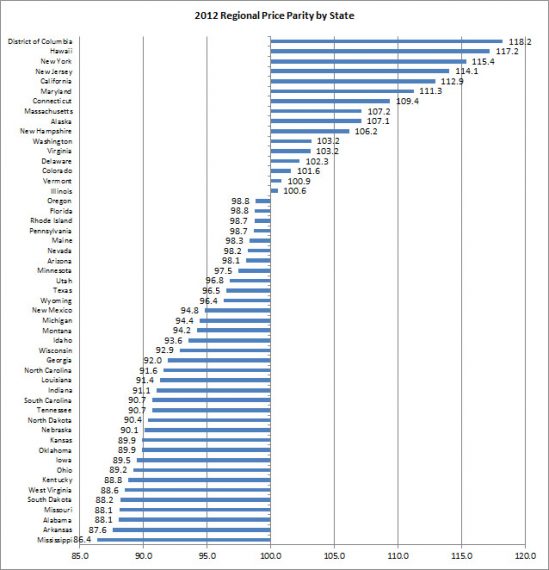
Aside from the fact, as the associated article spends its first several paragraphs admitting, that it’s monumentally stupid to consider DC, which is a tiny city, a state for the purposes of this comparison the chart massively overstates the disparities between top and bottom.
The top five states (outside of D.C.) were Hawaii, New York, New Jersey, California and Maryland, and the bottom five states were Mississippi, Arkansas, Alabama, Missouri and South Dakota. So, it costs 36% more to live in Hawaii than in Mississippi.
The spread between the cheapest state and the most expensive is a little over a third. But the chart makes it look like the difference between Burundi and Qatar.
Indeed, the price disparities across the United States are actually much, much less than I would have guessed. Even at the metropolitan area level, Honolulu, Hawaii, the most expensive in the country, is only 54% more expensive than Danville, Illinois, the least expensive.


I have actually spent time in the United States and know that these types of graphs are very misleading. For example, they ignore the fact that some states are much larger than others and contain quite a variety of climates. Furthermore, there is a lot of variation inside any of the states which is as great as the variation between the states. Life in Grosse Point is not like life in Detroit proper even though the distances are small. Same for NYC vs Binghamton, Malibu vs Watts, and many other examples.
This type of information is so devoid of meaning that it always makes me suspect that it is presented with the intent of trying to fool me into believing something false.
I get the top 8 states, but why is ALASKA number 9?!? In fact, it’s nearly the same cost as MA!
Isn’t the main purpose of graphics like so that people who live in DC and New York have a reason to believe they should have higher incomes than people who live elsewhere in the country?
I didn’t see anywhere in the methods what all they considered. Gas (~$4.10), staples (milk ~4.85/gal, bread ~$4/loaf), and rent are expensive here in Hawaii, but we don’t generally have to pay for heat or ac, most entertainment is free or near to free, and at any given time there is a reasonably good chance that someone will have extra fruit or fish they are looking to share with friends. All things considered it has come out about the same for us as living in South Bay, CA.
Seems to me like the difference between states is secondary compared to the differences within states. A thousand Rochesters dragging New York City down towards the median.
I’m more interested in apple-to-apple comparisons, to the extent possible. How do Los Angeles and San Francisco compare to Houston and Dallas? How about Tampa/StPete versus Minneapolis/StPaul? Albuquerque vs Tucson? Bum Farm Egypt in this state versus that state?
I tend to think of California as being really expensive. One of my cobloggers is from Palmdale. One day I looked it up and cost of living was actually about the same in Palmdale as it was in the place that I was raised. When we were doing our last job search there was an opportunity in Sacramento, which was itself under my expectations because when I think of “California” I am actually thinking of some specific places.
@trumwill: The article links the cities comparison.
San Fran is 121.3 vs Dallas’ 101. But I think even that’s somewhat misleading, in that Dallas may have a larger metro area with more variation.
@trumwill:
For the record, we here in Rochester think that NYC is dragging us down (or trying to get the bars to up the cost of booze and good food).
@James Joyner:
I honestly find the relatively small size of the difference to be quite shockingly small. BestPlaces puts DFW at right about the national median and SFBA at 70+% higher. Those are the numbers I am more accustomed to seeing.
It puts Dallas proper at significantly less than the average, and SF proper at double the average (Oakland at 32.5 above, Fort Worth about the same as Dallas).
Yeah, DC is small. Are you willing to strike the even-smaller Wyoming from the list for the same reason?
DC is not a state because Congress doesn’t want them to have a vote. Not their fault. (And I admire the chutzpah that puts “Taxation without representation” on their license plates.)
@DrDaveT: Wyoming is quite large; it’s just sparsely populated. But it’s got a combination of rural and urban areas whereas DC is just a tiny, compact, urban area. It’s a silly comparison to make is all.
@James Joyner:
Sorry; it didn’t occur to me that you might mean physical size, since I couldn’t see (and still can’t) why that would be relevant.
The point I thought you were making was about the variance (or lack thereof) in cost of living within various states. I can assure you that DC has a higher variance than Wyoming; the difference between Anacostia and Kalorama is greater than the difference between rural Wyoming and downtown Cheyenne. If DC is insufficiently diverse in cost of living to belong on the chart, then so is Wyoming.
@DrDaveT: I’m just pointing out, as does the article which accompanies the infographic, that it’s silly to compare a city and a state.
DC has slums; it doesn’t have rural areas.
@James Joyner:
You say that as if it were obvious, but it’s not. Sometimes it’s perfectly reasonable to compare a city and a state. Such as, when the two are comparable in population and in diversity of neighborhoods. If you can explain to me why it’s sensible to compare Rhode Island to Texas, but not DC to Texas, I’ll concede the point.
Correct. What’s your point? Why are rural poor different from urban poor, for purposes of comparing cost of living?