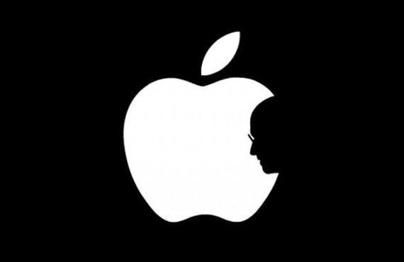
Steve Jobs Tribute Logo
The apple logo with Steve Jobs' profile instead of the bite mark is going viral.
For good reason, this logo is going viral:
Yahoo Tech (“Apple tribute logo a Web hit“):
When Steve Jobs resigned from Apple in August, 7,000 miles away in Hong Kong, graphic design student Jonathan Mak Long, “shocked” by the CEO’s departure, did what he knew best: He created a design to honor the Apple co-founder.
The 19-year-old posted the image, the Apple logo with the bite changed to a profile of Jobs, to his Tumblr blog. Known as Jonathan Mak, he initially received about 80 notes on the image. Then word came this past Wednesday that Jobs had died, after a long battle with cancer. Mak reposted the homage, which this time caught fire on the Web, attracting an almost immediate response of 10,000 likes and reblogs on his Tumblr site and surging to 180,000 — in one day. Comments included “awesome invention like steve jobs.” One thought it should be the “new Apple logo.” Another wanted to “use it as a tattoo.”
Speaking in fluent English (which he said he learned from watching the TV show “Friends”), the Polytechnic University School of Design student told Yahoo! in a Skype interview that the image was a tribute to Jobs’s contributions to the world: “I wanted to commemorate him. He’s such an integral part of Apple. I thought it would be fitting to include him in the Apple logo.” Long added, “With Jobs gone, Apple is literally missing a piece.”
Like many such things, it’s completely obvious in hindsight. But well done.

Almost brings a tear to the eye (and I don’t own anything from Apple).
The best logos are simple. The original Apple logo is simple (at least without the colors), as is this modification.
Please give credit where it’s due. A more ‘original’ version pre-dates this by nearly half a year: http://www.flickr.com/photos/raid71/5747221791/in/photostream