A MAP OF MANY COLORS
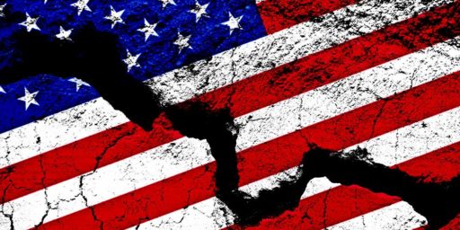
One of the most awful prospects of the next presidential election is the return of . . . that damn map. Depicting the results of the 2000 election, the reigning graphic of American politics divides the United States into two colors, red for Republican and blue for Democratic. It’s also the basis of a lot of simplistic political analysis. “The 2000 election map highlighted a deep cultural tension between the cities (the blue states) and the sticks (the red states),” as Matt Bai put it in the New York Times Magazine earlier this year. David Brooks described this schism in more acerbic tones in the Atlantic Monthly in 2001: “In Red America churches are everywhere. In Blue America Thai restaurants are everywhere.”
But this primary-color collage resonates only because it turns up the contrast. Given that more than 40 percent of voters in the blue states backed Bush and more than 40 percent of voters in the red states backed Gore, doesn’t the red vs. blue model seem, well, a bit black-and-white?
So CommonWealth decided to make a map of our own. Aiming somewhere between the reductionist red-and-blue model and the most accurate (but least useful) subdivision of the United States into infinity, we split the county into 10 regions, each with a distinct political character. Our regions are based on voting returns from both national and state elections, demographic data from the US Census, and certain geographic features such as mountain ranges and coastlines. (See “The 10 Regions of US Politics” for detailed descriptions.) Each region represents about one-tenth of the national electorate, casting between 10.4 million and 10.8 million votes in the 2000 presidential election.
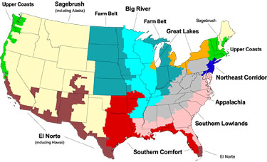
Click for larger version.
I find this map useful as a heuristic but it lacks the simplicity of the red-blue map. This is always a trade-off in these things: red-blue doesn’t convey subtlety very well but has the huge advantage of being instantly clear; the ten-color one has the reverse qualities. Moreover, people who are truly knowledgable will probably find even the ten-color version too simplistic–not to mention a little too cutesy (Southern Comfort?!). I therefore predict red-blue will almost certainly remain the dominant one used by the mass media.
For more on this topic, see this exchange with Brad DeLong.
Hat tip: Stephen Green


Ya know, looking at that map, you and I are in Appalachia. And yet Loudoun County couldn’t be further from Appalachia in terms of economy and social culture. Interesting.
That’s a weird map, imho.
Yeah- What they hell is up with Colorado? Are they Gerrymandering meaningless maps?
I had no idea that Appalachia extended to the Mississippi River. And it’s interesting to me that most of the shoreline of the Great Lakes appears not to be in the Great Lakes region.
Oh, and I lived in Alaska. While there I did see sagebrush growing in one place (but it had to be pointed out). Stranger than fiction.
—