Andrew Sullivan’s New Digs
James Joyner
·
Wednesday, January 18, 2006
·
6 comments
As promised a while back, Andrew Sullivan has moved his blog to Time magazine’s website. It comes with a new look and feel that Andrew assures us has reader e-mails “running almost ten-to-one in favor.”
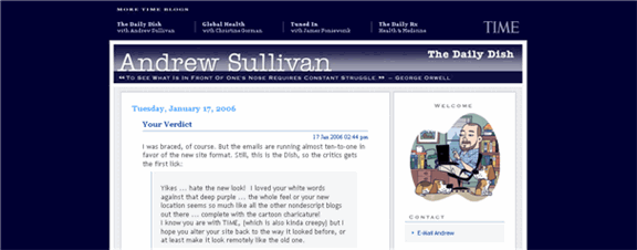
Andrew Sullivan’s “Daily Dish” new look Ann Althouse is among its admirers. Referring to the old look, she writes, “I understand why people are attracted to the elegant dark background with white letters. It looks pretty from a distance, but reading it is oppressive enough that you don’t notice it while you’re reading it, but you experience great relief when it’s gone.”

Andrew Sullivan’s “Daily Dish” old look Quite right. Both the old design and the new are attractive. The current version is not only better looking–not surprising, since one expects its design budget was much higher–but easier to read. As “cool” as light lettering on a dark background may be, there’s a reason most professional sites stick to black lettering against very light backdrops.
Now, if only a magazine would buy me out. . . .


expects its design budget was much higher
You would think that he could have spend some of the near $100K he got from his fundraising drives to get a better design! I could not stand the blue background, and have to select the white background just to make it readable to my eyes.
MARK – EXACTLY!
Amazing what a redesign will do for a site, even if it has the same whiny self-serving content.
You’d think that after he’d raised all those hundreds of thousands of dolalrs, he would have spent some of it on webdesign.
By the way, he’s still using the freebie version of Sitemeter on the official Time-sponsored weblog.
It’s one thing to beg for money and slum it when you’re only pulling in a hundred grand or so from begathons, but it’s ludicrous to be slumming it with freebie blog tools when you’re playing with multibillion-dollar company money.
It’s one thing to beg for money and slum it when you’re only pulling in a hundred grand or so from begathons, but it’s ludicrous to be slumming it with freebie blog tools when you’re playing with multibillion-dollar company money.
One would think the Sitemeter is there purely for purposes of things like the TTLB Ecosystem. I’m sure TIME has their own vastly more expensive ways of keeping track of eyeballs.
As to the “reverse” type (white on blue background), that’s a tale as old as the design hills, and the fact that sullivan got away with abusing his readers’ eyeballs for so long is a testament to his drawing power. Sometimes function trumps form.
Irrespective of the colors… and I happen to run a darkish background… I’ve always though Ann’s description fully applicable to Angry Andy’s WRITING ITSELF….you experience great relief when it’s gone.
Well, since hosting at the other end of the most expensive bandwidth in the world and using Blogger’s costly editor for posting, so awkward he required an assistant to handle things, sucked down 80 – 100k a year, he could hardly afford anything better without deep corporate pockets.