2004 Purple America
Yesterday evening, I put up maps of the 2004 Election County-By-County using the Red and Blue America imagery that became famous in 2000.
I’ve just stumbled across this via MSNBC:
Robert J. Vanderbei, Princeton University, Election 2004 Results
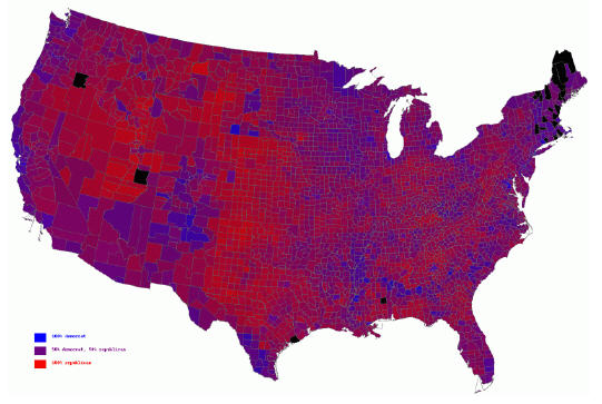
It creates the image of a less bifurcated America by weighing the red and blue hues by proportion of the popular vote in each county that went for Bush and Kerry. It should give Brad DeLong some solace.
Update: It turns out Brad found another version of it independently.


Certainly looks better for the Democrats this way, doesn’t it? Not nearly as much red. Once can see why Delong wanted this used… and why the press will likely adopt it.
Well, certainly, blue is darker and distorts the red more than the reverse. But DeLong’s point–made initially after an election in which his guy won a slim majority but lost in the Electoral College–is that we’re not really Two Americas in the way the pure Red and Blue map leads us to believe. Even in such Republican bastions as Alabama–or Democratic bastions like Oregon–there is 30-40 percent of the population who voted for the other guy. It’s a useful thing to keep in mind.
Another MSM ploy to make the republicans feel the need to apologize for only winning by 3 million.
Ah, I had the idea for something like this but didn’t want to bother to create one myself. It’s not exactly what I had in mind, but close.
All of this would be interesting if we had a proportional representation system. But we don’t and as it is Democratic victories are likely to become increasingly a phenomenon of big cities.
Actually, maps like this are far more accurate than the stark Red v. Blue. Many GOPers get a tad too excitred about the number of Red counties. Yes, Bush won decisively, but the standard by county count inflates the significance thereof. Winning a bunch of sparsely populated counties in Kansas isn’t as impressive as winning LA County, for example.
BTW–your MSNBC link goes to some alternative energy story…