YahooNews points me to a March 16 Telegraph column by Jake Wallis Simons titled “This could be the devastating proof that Hamas is faking its death figures.”
One of the marks of anti-Semitism, George Orwell observed in 1945, is “an ability to believe stories that could not possibly be true”. Which brings us smartly to Hamas and how the broadcast media, aid organisations, international bodies and world leaders take its disinformation as gospel. Last week it became clear that this gullibility may have led to a crime against reality.
A new analysis of the group’s casualty statistics indicates that the rag-tag terror army may have pulled off one of the biggest propaganda coups of modern times. The figures, repeated by everyone from the White House to the BBC, are freighted with familiarity: 30,000 dead in Gaza, 70 per cent of whom are women and children. Yet it now seems overwhelmingly likely that these statistics are fabricated.
Professor Abraham Wyner, a data scientist at the University of Pennsylvania, has conducted a thorough analysis. He found that Hamas’s official civilian death toll was statistically impossible. “Most likely, the Hamas ministry settled on a daily total arbitrarily,” he wrote in an incendiary essay in Tablet. “We know this because the daily totals increase too consistently to be real. Then they assigned about 70 per cent of the total to be women and children, splitting that amount randomly from day to day. Then they in-filled the number of men as set by the predetermined total. This explains all the data observed.”
The giveaways were many. For example, the reported death toll mounted “with almost metronomical linearity”, Prof Wyner found, showing little daily variation. Obviously, this bore no resemblance to any plausible version of reality. Then there was the fact that, according to Hamas data from 29 October, 26 men came back to life; and the fact that on several days, no men were apparently killed at all, but only women. Were we really supposed to believe any of this?
In February, Hamas admitted to losing 6,000 of its fighters, representing more than 20 per cent of the total casualties reported. Given its claims that 70 per cent of the dead were women and children, there were two possible conclusions: either almost no male civilians had died, or almost all the men in Gaza were fighting for Hamas. Both were obviously absurd.
Therefore, the number of women and children killed was likely grossly exaggerated. If that is the case – if, as Prof Wyner suggests, “the casualties are not overwhelmingly women and children, and the majority may be Hamas fighters” – where does that leave western outrage? Has the West fallen victim to a monstrous con?
The true ratio of civilian casualties to combatants is likely to be exceptionally low, “at most 1.4 to 1 and perhaps as low as 1 to 1”. This, Prof Wyner says, is a “successful effort to prevent unnecessary loss of life while fighting an implacable enemy that protects itself with civilians”.
While I had been naturally skeptical of casualty reports issued by a terrorist group (and, frankly, I tend to be skeptical of any party to a war’s real-time numbers given both the very real propaganda incentives for misrepresentation and the “fog of war” making these assessments fraught even for honest brokers), I had seen enough claims by experts that we should take them seriously that I more-or-less stopped asking.
Looking at Wyner’s bio, CV, and Google Scholar pages, I consider him a highly qualified expert data scientist. He earned his PhD in Statistics from Stanford in 1993, has won multiple awards, and is a prolific and well-cited scholar. Judging from the handful of articles he’s published at Tablet and Forward, he seems to be an ardent Zionist and something of a COVID and climate change skeptic but there aren’t enough red flags to overcome his stature as a top-rate scholar.
Still, that works both ways. He published the above-referenced essay (“How the Gaza Ministry of Health Fakes Casualty Numbers“) on March 6. Even granting that he’s a statistician rather than an International Relations or Security Studies scholar, you’d think such devasting findings from someone of his stature would have made it to my attention in the intervening two weeks.
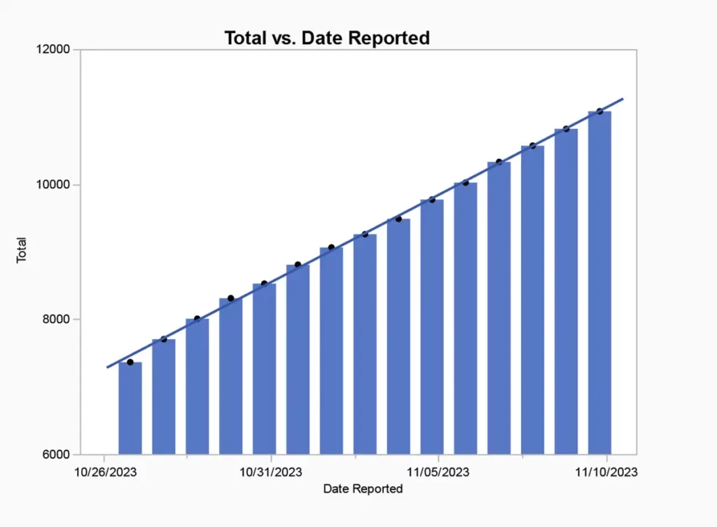
Wyner’s main evidence is in this chart:
About which he observes,
This regularity is almost surely not real. One would expect quite a bit of variation day to day. In fact, the daily reported casualty count over this period averages 270 plus or minus about 15%. This is strikingly little variation. There should be days with twice the average or more and others with half or less. Perhaps what is happening is the Gaza ministry is releasing fake daily numbers that vary too little because they do not have a clear understanding of the behavior of naturally occurring numbers. Unfortunately, verified control data is not available to formally test this conclusion, but the details of the daily counts render the numbers suspicious.
I stumbled on Caltech computational biologist Lior Pachter‘s March 8 post (“A note on ‘How the Gaza Ministry of Health Fakes Casualty Numbers’“) responding to Wyner’s analysis.
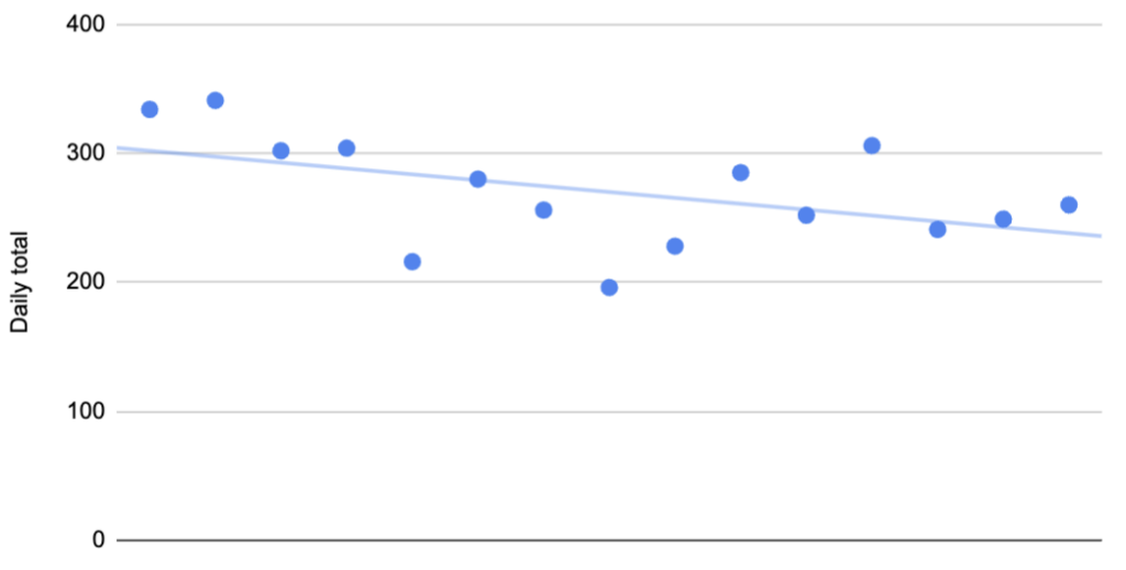
Wyner’s plot shows cumulative reported deaths over a period of 15 days from October 26, 2023 to November 10, 2023. The individual reported deaths per day are plotted below. These numbers have a mean of 270 and a standard deviation of 42.25:
The coefficient of determination for the points in this plot is R2 = 0.233. However, the coefficient of determination for the points shown in Wyner’s plot is R2 = 0.999. Why does the same data look “extremely regular” one way, and much less regular another way?
If we denote the deaths per day by , then the plot Wyner shows is of the cumulative deaths . The coefficient of determination R2, which is the proportion of variation in the dependent variable (reported deaths) predictable from the independent variable (day), is formally defined as where is the sum of squares of the residuals and and is the variance of the dependent variable. Intuitively, R2 is a numerical proxy for what one perceives as “regular increase”.
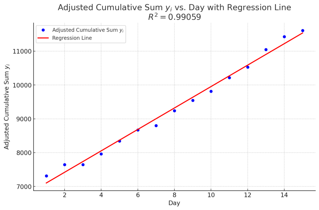
In the plots above, the are roughly the same, however is much, much, higher for the yi in comparison to the xi. This is always true when transforming data into cumulative sums, and is such a strong effect, that simulating reported deaths with a mean of 270 but increasing the variance ten-fold to 17,850, still yields an “extremely regular increase”, with R2 = 0.99:
Sadly, I must confess that my long-ago statistical training has atrophied, and I likely never would have fully understood Pachter’s equations. In response to a commenter, though, he adds this bit of clarity:
There could be many reasons for these correlations. Maybe it’s an artifact of the age threshold for children and the distribution of age in Gaza. Maybe it’s the result of lags in recording deaths. Maybe it’s a happenstance arising from so few datapoints. Maybe the data was indeed faked.
I’ll note that there are all sorts of anomalies one can grasp onto. I noticed, for example, that the average, 270 is an integer. Adding up 15 random numbers and then dividing by 15 is unlikely to yield an integer. But it can happen (7% of the time). When one starts floating tons of hypotheses, especially with little data, evidence for one of them doesn’t carry significance.
Additionally, commenter Ken M adds this insight:
If you look at the numbers, it’s very clear that they update fatalities faster than the update #women or #children (and they don’t specify #men, that is just (#fatalities – #women-#children)). On some days fatalities update but there is no change in the #w or #c; on other days the increase in (#w+#c) exceeds the increase in #f. In other words, in the conditions of war, it is hard to get information. The Gazan Ministry of Health (GMH) makes a list of the name and ID # of every identifiable death; Israel maintains the registry of ID #’s so GMH can’t fake that. That’s why their numbers come out accurate. But in real time, they may get a number of fatalities from a hospital and get the names, which allow identification of #w or #c, only later, maybe much later. And if they get the list of names, they have to go through the registry to determine who is a child or an adult, and maybe for ambiguous names who is a woman or a man, and that probably takes time too. So #w and #c get updated with arbitrary lags, sometimes multiple days worth may suddenly get updated at once. So looking at day-by-day movements of these #’s is meaningless.
I’ll add two other things. First, he says there is no correlation between increment in #women and increment in #children, just like Lior showed that there is no correlation between increment in #fatalities and time. But if you look at the cumulative #women vs the cumulative #children, you get perfect correlation, R^2=0.99 (I checked), just like he finds perfect correlation between cumulative #fatalities and time. Second, for his day-by-day anticorrelation between women and men: because they don’t specify men, only #w and #c, and because they may update in bunches, when there is an update of a lot of women, it will look like there’s not many men (i.e. change in fatalities – change in (women + children) is small, or even negative). When there’s an update where they don’t know the identities so it looks like there’s no increase in the #women, it will look like there’s a big increase in men – all the fatalities will appear to be men. So that’s why you get an anticorrelation between #women & #men.
Looking at the numbers as a lapsed data scientist but as a still-engaged Security Studies scholar, my immediate problem with Wyner’s analysis was his assumption that the daily correlation between males and/or Hamas fighters killed and those of women and children ought to be pretty consistent. But there’s no reason that should be the case. The battlefield isn’t a constant, after all. Air strikes are likely to kill a much high percentage of noncombatants than commando raids, for example.
Further, Wyner himself acknowledges the fog of war and says, “The truth can’t yet be known and probably never will be.” Yet, the whole tone of the piece is one of certitude: Hamas is obviously faking the numbers.
“The numbers are not real. That much is obvious to anyone who understands how naturally occurring numbers work. The casualties are not overwhelmingly women and children, and the majority may be Hamas fighters.”
Only a bit of caveating here: “Perhaps what is happening is the Gaza ministry is releasing fake daily numbers that vary too little because they do not have a clear understanding of the behavior of naturally occurring numbers. Unfortunately, verified control data is not available to formally test this conclusion, but the details of the daily counts render the numbers suspicious.”
And here: “While the evidence is not dispositive, it is highly suggestive that a process unconnected or loosely connected to reality was used to report the numbers. Most likely, the Hamas ministry settled on a daily total arbitrarily.”
All in all, I would be much more comfortable with “Be Cautious About Gaza Ministry of Health Casualty FIgures” than “How the Gaza Ministry of Health Fakes Casualty Numbers.”
James Joyner is a Professor of Security Studies. He's a former Army officer and Desert Storm veteran. Views expressed here are his own. Follow James on Twitter @DrJJoyner.
In war, truth is the first casualty. ― Aeschylus (c. 525 – c. 456 BCE)
It’s prudent to apply a deal of skepticism to anything Hamas claims. And to anything Israel claims. But there’s no question a lot of people are getting killed, including women, children, and innocent men. There’s no question food and medical provision is inadequate.
There are a bunch of big red flags in Hamas’ numbers, and I don’t think they should be taken at face value. However, I think this guy is way overconfident in his conclusion that they are just making stuff up. Lying with statistics is usually a case of manipulation and omission, not fabrication.
You know, that one graph looks very very artificial to me.
And, you say this:
Even granting that he’s a statistician rather than an International Relations or Security Studies scholar, you’d think such devasting findings from someone of his stature would have made it to my attention in the intervening two weeks.
Well, this kind of thing is something I have observed quite a few times. If you’re some guy rather than someone in the loop, it can take quite a long time before anybody pays attention to you. And it doesn’t matter how good you are, or how good your argument is. They don’t know you, they don’t care.
This says nothing at all about how good the details of his argument is. But that first graph looks suspicious as hell to me. And I am quite ready and willing to believe that propaganda is the order of the day for all parties involved. (I don’t for a second think Netanyahu is more truthful.)
One of the marks of anti-Semitism, George Orwell observed in 1945, is “an ability to believe stories that could not possibly be true”. Which brings us smartly to Hamas and how the broadcast media, aid organisations, international bodies and world leaders take its disinformation as gospel. Last week it became clear that this gullibility may have led to a crime against reality.
Lmao, a crime against reality.
Shockingly, Wyner turns out to be a climate denialist. Can’t believe a statistician at a business school who knew nothing about one field has weighed in on another field.
Judging from the handful of articles he’s published at Tablet and Forward, he seems to be an ardent Zionist and something of a COVID and climate change skeptic but there aren’t enough red flags to overcome his stature as a top-rate scholar.
Covid and Climate Change “skepticism” are really gigantic red flags, especially for anyone who deals with numbers. Toss in the Zionism and you have someone who not only lives adjacent to reality at best, but also has a strong motivation for the reality to be different.
Would you be so willing to say “he seems to be a 9/11 truther, but…”? No, certain beliefs are indicative of crazy shit across the board.
If there is anything real in this dude’s analysis, it will be picked up and poked enough by clearly reputable people who aren’t at least a few stops down the line to Crazy Town. At present, however, everyone reputable has been accepting the Hamas numbers are mostly accurate.
I will also point out that he is looking at data from 15 days, when the Israeli military operation has been going on for about 10 times that long. That suggests data picking.
How on earth is Hamas supposed to know exactly how many casualties occur on a daily basis? Who is keeping track? And how? After all, civil administration is barely functioning.
It is obvious that we have been getting casualty estimates pretty much from the beginning following Israel’s recent attacks on Gaza.
So how’s Hamas track record on reporting casualty numbers/estimates? Historically, they have been reasonably reliable, as far as independent observers have been able to ascertain. (Although I personally wouldn’t necessarily trust their combatant/non-combatant percentages.)
and world leaders take its disinformation as gospel.
The figures, repeated by everyone from the White House to the BBC
Yeah, totally believable that the White House is taking blatantly inflated numbers as gospel. Especially when this is being claimed by an ardent Zionist and climate/Covid denialist.
Let’s face it: any statistic anomalies are obviously the result of the casualty numbers being estimates. That doesn’t mean that these figures are being conjured out of thin air.
Jake Wallis Simons is demanding a level of certainty that simply cannot be had in Gaza in 2024. And because he isn’t getting that level of certainty, everything must necessarily be a lie, he claims.
Moral of the story: Whenever someone is making an analysis of statistics to argue for a conclusion on the part of the reader, it’s important for the reader to consider what biases the reporter brings and how those biases affect the conclusions he asks from the reader. Or, as I used to express it to my composition students
Who is the researcher/reporter working for and what types of conclusions is the employer interested in presenting?
The perception that this guy is a Zionist does not make his conclusions suspect or incorrect, but for me, I’ll need to get more corroboration from additional sources to buy the proposition.
For others, this is what they’ve been needing all along. Surely now, everyone will need to admit that the accusations of genocide and ethnic cleansing are just baseless. Right?
Clearly all the dead children are merely crisis actors hired to cover up a false-flag operation. They probably sit around chortling about how much they booked off their Sandy Hook gig the first time they pretended to be dead to prop up a fascist regime. Damn prosti-tots.
@Just nutha ignint cracker: off topic, but I love it when you point out lessons from your teaching experience, especially about writing/rhetoric. I wish I could have taken one of your classes. I’m sure I would have learned a lot about both writing AND about life. I’ll have to settle for these tidbits
I always assume both sides are lying when it comes to numbers. A tip-off, IMO, that Wymer is selectively using numbers is not giving all of the raw numbers in the article or posting the second graph that was done by Pachter. If you are trying to fudge stuff with stats you always hold back raw data. If you want to claim the same number of people are killed everyday then post the graph done by Pachter.
It has been my regular (and silent) reaction to news reporting about the death toll – which is tragic at any level – is why do they keep referring to the toll without consistently identifying it as Hamas’s representation.
@Erik: Thanks! Sadly, where I taught, until I got to Korea, my style was sort of an acquired taste. My Rate My Professor score was 3, evenly divided between fives and ones. Still, teaching was a blast and I never regretted the cut in pay I took to move to that job. As Luddite noted to me once in a while, I didn’t grow up in a cohort of society where people had careers, so the fact that I only had a teaching “job” didn’t trouble me particularly.
Judging from the handful of articles he’s published at Tablet and Forward, he seems to be an ardent Zionist and something of a COVID and climate change skeptic but there aren’t enough red flags to overcome his stature as a top-rate scholar.
This is the most bizarre sentence I’ve ever seen from you, James. It’s the equivalent of “He believes the moon is made of green cheese, and that Hillary Clinton is running a pedophile ring out of the basement of a pizza parlor, but that’s not enough to overcome his stature as a top-rate scholar.” No, really, it is.
, then the plot Wyner shows is of the cumulative deaths
. The coefficient of determination R2, which is the proportion of variation in the dependent variable (reported deaths) predictable from the independent variable (day), is formally defined as
where
is the sum of squares of the residuals and and
is the variance of the dependent variable. Intuitively, R2 is a numerical proxy for what one perceives as “regular increase”.
It’s prudent to apply a deal of skepticism to anything Hamas claims. And to anything Israel claims. But there’s no question a lot of people are getting killed, including women, children, and innocent men. There’s no question food and medical provision is inadequate.
There are a bunch of big red flags in Hamas’ numbers, and I don’t think they should be taken at face value. However, I think this guy is way overconfident in his conclusion that they are just making stuff up. Lying with statistics is usually a case of manipulation and omission, not fabrication.
You know, that one graph looks very very artificial to me.
And, you say this:
Well, this kind of thing is something I have observed quite a few times. If you’re some guy rather than someone in the loop, it can take quite a long time before anybody pays attention to you. And it doesn’t matter how good you are, or how good your argument is. They don’t know you, they don’t care.
This says nothing at all about how good the details of his argument is. But that first graph looks suspicious as hell to me. And I am quite ready and willing to believe that propaganda is the order of the day for all parties involved. (I don’t for a second think Netanyahu is more truthful.)
One of the marks of anti-Semitism, George Orwell observed in 1945, is “an ability to believe stories that could not possibly be true”. Which brings us smartly to Hamas and how the broadcast media, aid organisations, international bodies and world leaders take its disinformation as gospel. Last week it became clear that this gullibility may have led to a crime against reality.
Lmao, a crime against reality.
Shockingly, Wyner turns out to be a climate denialist. Can’t believe a statistician at a business school who knew nothing about one field has weighed in on another field.
Covid and Climate Change “skepticism” are really gigantic red flags, especially for anyone who deals with numbers. Toss in the Zionism and you have someone who not only lives adjacent to reality at best, but also has a strong motivation for the reality to be different.
Would you be so willing to say “he seems to be a 9/11 truther, but…”? No, certain beliefs are indicative of crazy shit across the board.
If there is anything real in this dude’s analysis, it will be picked up and poked enough by clearly reputable people who aren’t at least a few stops down the line to Crazy Town. At present, however, everyone reputable has been accepting the Hamas numbers are mostly accurate.
I will also point out that he is looking at data from 15 days, when the Israeli military operation has been going on for about 10 times that long. That suggests data picking.
How on earth is Hamas supposed to know exactly how many casualties occur on a daily basis? Who is keeping track? And how? After all, civil administration is barely functioning.
It is obvious that we have been getting casualty estimates pretty much from the beginning following Israel’s recent attacks on Gaza.
So how’s Hamas track record on reporting casualty numbers/estimates? Historically, they have been reasonably reliable, as far as independent observers have been able to ascertain. (Although I personally wouldn’t necessarily trust their combatant/non-combatant percentages.)
Yeah, totally believable that the White House is taking blatantly inflated numbers as gospel. Especially when this is being claimed by an ardent Zionist and climate/Covid denialist.
Let’s face it: any statistic anomalies are obviously the result of the casualty numbers being estimates. That doesn’t mean that these figures are being conjured out of thin air.
Jake Wallis Simons is demanding a level of certainty that simply cannot be had in Gaza in 2024. And because he isn’t getting that level of certainty, everything must necessarily be a lie, he claims.
The guy is a fraud.
Moral of the story: Whenever someone is making an analysis of statistics to argue for a conclusion on the part of the reader, it’s important for the reader to consider what biases the reporter brings and how those biases affect the conclusions he asks from the reader. Or, as I used to express it to my composition students
The perception that this guy is a Zionist does not make his conclusions suspect or incorrect, but for me, I’ll need to get more corroboration from additional sources to buy the proposition.
For others, this is what they’ve been needing all along. Surely now, everyone will need to admit that the accusations of genocide and ethnic cleansing are just baseless. Right?
Clearly all the dead children are merely crisis actors hired to cover up a false-flag operation. They probably sit around chortling about how much they booked off their Sandy Hook gig the first time they pretended to be dead to prop up a fascist regime. Damn prosti-tots.
PS — I’ve just entered the governor’s race in North Carolina.
@Just nutha ignint cracker: off topic, but I love it when you point out lessons from your teaching experience, especially about writing/rhetoric. I wish I could have taken one of your classes. I’m sure I would have learned a lot about both writing AND about life. I’ll have to settle for these tidbits
I always assume both sides are lying when it comes to numbers. A tip-off, IMO, that Wymer is selectively using numbers is not giving all of the raw numbers in the article or posting the second graph that was done by Pachter. If you are trying to fudge stuff with stats you always hold back raw data. If you want to claim the same number of people are killed everyday then post the graph done by Pachter.
Steve
It has been my regular (and silent) reaction to news reporting about the death toll – which is tragic at any level – is why do they keep referring to the toll without consistently identifying it as Hamas’s representation.
I sort of want to believe this, but the smell of bullshit is hard to ignore.
Lies, damn lies, and statistics – Mark Twain
@Erik: Thanks! Sadly, where I taught, until I got to Korea, my style was sort of an acquired taste. My Rate My Professor score was 3, evenly divided between fives and ones. Still, teaching was a blast and I never regretted the cut in pay I took to move to that job. As Luddite noted to me once in a while, I didn’t grow up in a cohort of society where people had careers, so the fact that I only had a teaching “job” didn’t trouble me particularly.
I’ll keep trying to remember new stories to tell.
This is the most bizarre sentence I’ve ever seen from you, James. It’s the equivalent of “He believes the moon is made of green cheese, and that Hillary Clinton is running a pedophile ring out of the basement of a pizza parlor, but that’s not enough to overcome his stature as a top-rate scholar.” No, really, it is.