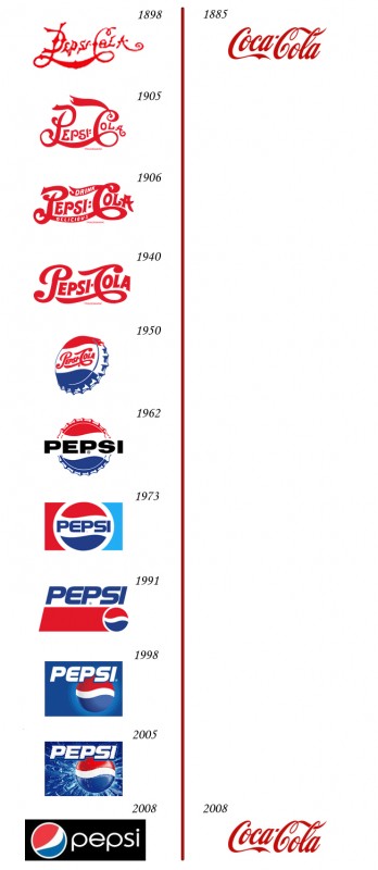
Coke and Pepsi Logos: The Real Thing
This logo has been making the rounds on the blogs the last few days.
While it’s amusing, it struck me as rather silly. While it attempts to show the value of sticking with a brand rather than constantly tinkering, Pepsi is a spectacularly successful product. Further, all of the Pepsi logos going back to 1950 are minor variations on the brand; any one of them is instantly recognizable as Pepsi.
It turns out, however, that the graphic is complete BS. In fact, Coke has changed its logo with similar frequency:
(The “black” Coke logos are taken from black-and-white ads; Coke has in fact used the red color scheme for consistently.)
Much, much more history on this at Armin‘s post.


Hm. Even in the second graphic, Coca-Cola sticks with with mostly the same cursive style, with the obvious and glaring exception of the “New Coke” abortion.
True. But Pepsi has developed a pretty consistent brand starting with the 1950 introduction of the red-white-blue scheme with the waves. Before that, arguably, it was ridiculously derivative of Coke’s logo.
Greetings:
I think that there maybe some confusion between a logo and a logotype here. The Coca-Cola being more the later and the Pepsi versions more of the former. My recollection is that if the image is just type, of whatever face or format, it is more correctly referred to as a logotype. Once it uses or involves non-type graphic images, it would be more correctly referred to as a logo.
Graphics and printing being both art and craft, I’m sure that there will be a variance of opinion. Some of the older printing terms, like logotype, are rarely used nowadays. I’m afraid that I’m kind of on the “MACs killed typography” end of the spectrum as the increased and useful capability fell into the hands of too many uneducated and untrained people. But, I’m living with it.
I do think Pepsi has made an error with its latest branding, though. It looks like a store brand now.