Cool Infographic – Evolution of Superman’s “S” Shield
Superman's famous shield changes from 1938 to present.
Given the high politics/technology/comic-book fan crossover rate, I thought folks would enjoy this infographic series that Kate Willaert created for HalloweenCostumes.com:
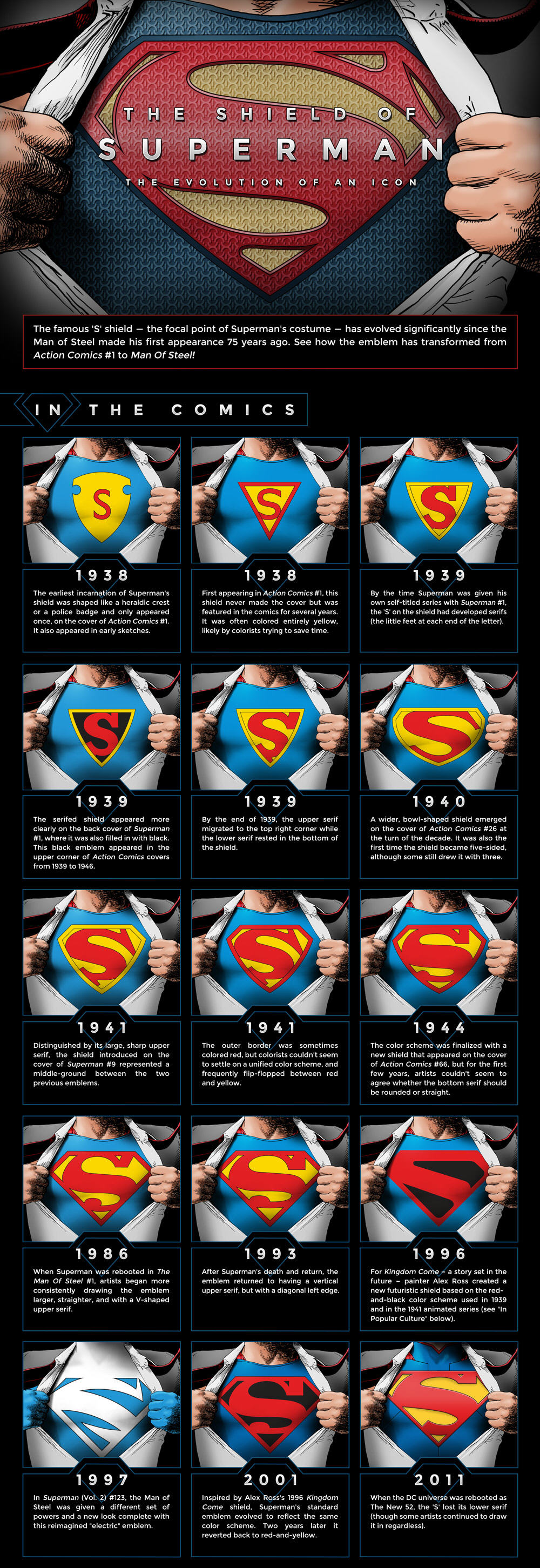
Couple things jump out. I knew that the design went through some initial iteration, but I was a bit surprised that there were at least nine separate “major” designs (10 if you count the Fleischer Cartoon symbol below) used in the first six years. I was also surprised by how stable the design was from 1944 to the early 90’s (though I think that the shield moved to a straight sided design well before 1986).
Of course, that might be because I only got into comics in the 90’s. So I’ve been conditioned to expect a rebranding every few years (see above). I wonder how much of the recent churn is due to the explosion of action figures and other forms of character licensing.
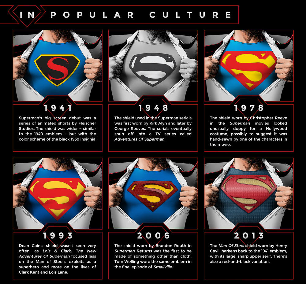
Kate also did a chart of the shield in popular culture (which, while still cool, missed discussing both The Super Friends and Superman: The Animated Series):
For extra fun, here’s a picture from Kate’s tumbler that seems to be screaming to be used in the caption contest (paging Rodney Dill).


A former girlfriend has a Superman emblem tattoo’ed on one of her buttocks.
Now it’s killing me to know what vintage it is!!!
Damn you, OTB
@Sam Malone:
http://www.youtube.com/watch?v=KbQluo1gazc
’nuff said
John Byrne said that he always saw the logo as two fish swimming in opposite directions, and drew it that way. It’s an interesting way to look at it — focusing on the yellow, not the red.
But it’s really annoying when they try to spin it as something other than an “S”…
@Jenos Idanian #13:
Never had a real problem with that. I think the idea that the “S” is actually the crest of the El family and just happens to look like an “S” is a great Sci-Fi nod (similiar to the way that the Doctor just happens to sound British).
To that point, I think the current movie crest pulls both pretty well. I like how the bottom of the “S” goes directly into the edge of the shield. Though there’s also something rather dragon like about it — which might tie into the critters they’re shown riding in the trailer.
I also like the nu-52 shield, but hate the armor around it.