Democratic Contender Websites
A deep dive into typography and naming choices.
Matthew Butterick, who has the unusual combination of a visual-studies degree from Harvard and a law degree from UCLA, analyzes the typography of the 2020 Democratic presidential contenders’ websites, from frontrunner to obscure.
His rationale for why you should care:
For those who think it trivializes our political process to judge candidates by their typography—what would you prefer we scrutinize?
Qualifications? Ground into dust during the last election. Issues? Be my guest. Whether a candidate will ever fulfill a certain campaign promise about a certain issue is conjectural.
But typography—that’s a real decision candidates have to make today, with real money and real consequences. And if I can’t trust you to pick some reasonable fonts and colors, then why should I trust you with the nuclear codes?
His takeaways:
I wasn’t impressed by any of the websites, none of which exceeded the high end of mediocre—what you might find in an $18/month Squarespace plan.
- Of course, there were a ton of Gothamesque geometric sans serifs.
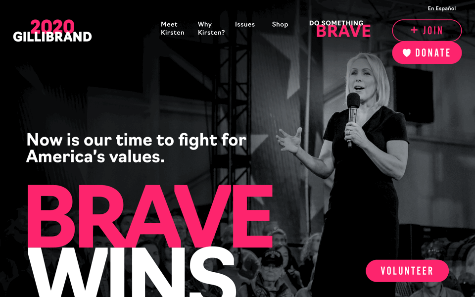
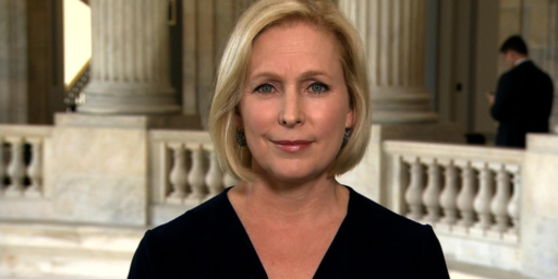
- The candidate who was most successful stoking my curiosity with design was Kirsten Gillibrand.
- I was surprised that the long-shot candidates weren’t taking more chances with their websites—what the hell have they got to lose?
- Though I suppose Julián Castro, whose site was as boring as any, was nevertheless the most competent.
- Among current front-runner-ish candidates, Kamala Harris was the worst underperformer, with Beto O’Rourke second worst.
- Overall worst in show: Cory Booker, who apparently decided to run for president on a Monday, crowdsourced his website on Tuesday, and launched it on Wednesday. Unbearable.
His candidate-by-candidate analysis is interesting and frequently amusing. The screencap from Kirsten Gillibrand used atop this post was his favorite.
One thing he doesn’t cover that I found interesting is the use of first names. It has been frequently remarked that we tend to diminish female candidates by referring to them by their first names, while seldom doing that with male candidates. So I was somewhat intrigued by how many of the women running this cycle emphasized their first name on their sites. Yet, upon closer examination, there was no real pattern.
Candidates who went first-name-only in their primary logo:
- Cory Booker
- Pete Buttigieg
- Julián Castro
- Tulsi Gabbard
- Amy Klobuchar
- Wayne Messam
- Beto O’Rourke
- Bernie Sanders
- Marianne Williamson
Candidates who were last-name-only in their primary logo:
- John Delaney
- Kirsten Gillibrand
- John Hickenlooper
- Jay Inslee
- Elizabeth Warren
- Andrew Yang
Candidates whose primary logo gives essentially equal prominence to both names:
- Kamala Harris
- Tim Ryan
- Eric Stalwell
Candidates who used first-name-only in a secondary location, such as a donation or “about the candidate” link:
- Gillibrand
- Harris
- Hickenlooper
- Ryan
- Yang
There’s no obvious gendered pattern here: Almost all of the candidates, regardless of sex, used first-name-only in their primary logo, a secondary link, or both. The only last-name-only-all-the-time candidates are Elizabeth Warren, a woman with a reasonable shot at the nomination, and a handful of guys (Delaney, Inslee, and Yang) who have no shot at all.
Hat tip: Tyler Cowen


Have to agree in general with Mr. Butterick.
Some years back, on a day when I had hit too many web sites that tempted me to ask of the designer, “Did you study ugly and unreadable in school, or are you just naturally gifted?” I set out to write a bit of software to enforce my own choice of fonts and sizes on every page I downloaded. By now it is successful most of the time. Almost all of the candidates’ pages were, IMO, better after my software got done with them.
good eye, it does look like a section headline in Vanity Fair.
@Michael Cain: I was forced to resort to this when it became the style to make your text thin and in light gray on a bright white background, I suppose because crack became trendy with web designers, I don’t know. Overriding tiny grey text to black Franklin Gothic really improved things.
I’d go with Castro’s site, followed by Beto and Gabbard. Definitely didn’t like Gillibrand’s site. It looks like the splash page for a Vogue or Elle puff piece with the pink lettering over a grayscale background promising a bunch of feminist platitudes about “being a powerful, accomplished woman in a world that tells women to sit down and be quiet” mixed with various “but look how normal and approachable she still is” personal anecdotes.
With a first name like that …
@Franklin: Ha. Fixed. I noticed the typo when I was putting in the data but left to copy a Julián with the requisite accent mark and then forgot to fix the Bete.
Bête Buttigieg 2020 – He’s a Beast!
(All 750 French-speaking Americans would laugh, I assure you)
I’m reminded of the early days of the internet, when a Chicago Sun Times columnist kept track of which candidates in the 96 election used a .com and which a .org address for their website (I frequented the Sun Times site to read Roger Ebert’s reviews).
@Teve:
As opposed to Obama, who was the GOP’s bête noir?
Gillibrand’s website looks like she is singing. Black and white photo, black dress, and a microphone. Possibly for a breast cancer benefit. The “donate” and “join us” buttons fit with that perfectly.
“Do Something Brave” and “Brave Wins” with hot pink “Brave” really makes me think of people struggling with cancer — largely because no one calls themself brave. The two lines are clunky, and I almost think that “brave” is an acronym.
The only thing that suggests she is running for the presidency is the “2020”, but there are probably other explanations for that — a goal of ending breast cancer in a year, or maybe something about vision. Or just when this benefit concert will happen.
@DrDaveT: they considered Obama a literal bête noir.
@Teve:
I think that the average French speaker hears: He’s an idiot!