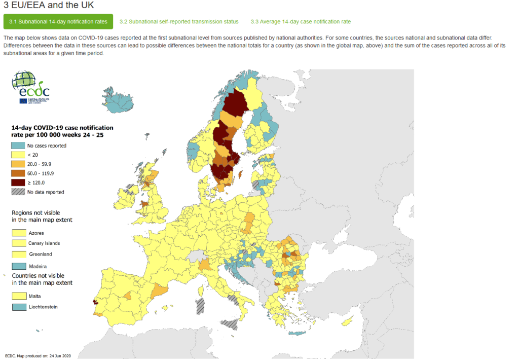
Remember back when a major right-wing media talking point (one that I heard repeated by a colleague just recently) that Sweden’s approach to Covid-19 (i.e., not engaging in a shut down) was proving the rest of the world wrong? Well, as James Joyner noted a while ago, that ended up not being the case.
The latest evidence to this point is pretty stark:
Steven L. Taylor is a Professor Emeritus of Political Science and former College of Arts and Sciences Dean. His main areas of expertise include parties, elections, and the institutional design of democracies. His most recent book is the co-authored A Different Democracy: American Government in a 31-Country Perspective. He earned his Ph.D. from the University of Texas and his BA from the University of California, Irvine. He has been blogging since 2003 (originally at the now defunct Poliblog).
Follow Steven on Twitter and/or BlueSky.
The things you don’t know until you look at a map! What’s up with Chili? And Saudi Arabia! Who’s doing the counting there? And I would have guessed that the Philippines would be dark brown unless there’s a real surprise in who gets to keep the roll.
We should be grateful that Sweden took a different tack than Norway, Denmark, and Finland. This gives us a chance to analyze strategies for the next pandemic which will certainly occur.
Maps based on area give misleading information. They should be normalized for population. US political maps make Montana, populated by four guys named Ennis, look more important than Connecticut, populated by a million guys named Bryce.
US political maps make Montana, populated by four guys named Ennis, look more important than Connecticut, populated by a million guys named Bryce.
One of my (many) pet peeves is tthe usual excuse that well of course Ds are under-represented, they insist on crowding into cities so of course they’re all jammed together into a few districts. All redistricting should be done on cartographs with square inches on paper representing population, not acreage.
@JohnMcC:
It’s not a map of covid infections, but of Covid *test*, and it further doesn’t seem to be adjusted for population. Sweden has *tripled* the amount of tests the last week, so you get more “case notifications” while in reality infections have dropped.N Sweden has very little population for instance, so without population adjustment single cases makes it shine “red”.
There are lies, damn lies, statistics and corona statistics…
Hi, Swedish here. These curves are totally insignificant, because they only mirror the amount of people being tested. Sweden has started to ramp up testing like crazy in the last two weeks. In most parts it is now free for anyone to get a Covid19 test and/or a anti-body test. This means that the amount of reported has risen sharply, since the amount of tested people has gone up 2-3x times in just 2 weeks time. It does not mean that spread is increasing. The peak was around April 11.
The only 3 important metrics are:
1) deaths due to corona <- dropping steadily
2) ICU patients due to corona <- dropping steadily
3) excess deaths compared from earlier years. <- since beginning of June, no excess deaths.
3 is most important. It means that no more people are dying per day now during the same week the previous years, 2015, 2016,. 2017. 2018 or 2019. I.e the years before the Corona virus existed.
I thin this article is very misleading.
Sincerely,
Joakim


The things you don’t know until you look at a map! What’s up with Chili? And Saudi Arabia! Who’s doing the counting there? And I would have guessed that the Philippines would be dark brown unless there’s a real surprise in who gets to keep the roll.
But Sweden? No surprises!
Thank you, Dr T.
Stupid is as stupid does.
We should be grateful that Sweden took a different tack than Norway, Denmark, and Finland. This gives us a chance to analyze strategies for the next pandemic which will certainly occur.
Maps based on area give misleading information. They should be normalized for population. US political maps make Montana, populated by four guys named Ennis, look more important than Connecticut, populated by a million guys named Bryce.
@Slugger:
One of my (many) pet peeves is tthe usual excuse that well of course Ds are under-represented, they insist on crowding into cities so of course they’re all jammed together into a few districts. All redistricting should be done on cartographs with square inches on paper representing population, not acreage.
@Slugger:
I laughed out loud at this one. Well done.
@gVOR08: Redistricting is done via population, not acreage.
@JohnMcC:
It’s not a map of covid infections, but of Covid *test*, and it further doesn’t seem to be adjusted for population. Sweden has *tripled* the amount of tests the last week, so you get more “case notifications” while in reality infections have dropped.N Sweden has very little population for instance, so without population adjustment single cases makes it shine “red”.
There are lies, damn lies, statistics and corona statistics…
–AE
Hi, Swedish here. These curves are totally insignificant, because they only mirror the amount of people being tested. Sweden has started to ramp up testing like crazy in the last two weeks. In most parts it is now free for anyone to get a Covid19 test and/or a anti-body test. This means that the amount of reported has risen sharply, since the amount of tested people has gone up 2-3x times in just 2 weeks time. It does not mean that spread is increasing. The peak was around April 11.
The only 3 important metrics are:
1) deaths due to corona <- dropping steadily
2) ICU patients due to corona <- dropping steadily
3) excess deaths compared from earlier years. <- since beginning of June, no excess deaths.
3 is most important. It means that no more people are dying per day now during the same week the previous years, 2015, 2016,. 2017. 2018 or 2019. I.e the years before the Corona virus existed.
I thin this article is very misleading.
Sincerely,
Joakim