Most Dishonest Chart Ever?
The Examiner's James Simpson makes a perfectly valid point in the most dishonest way with his chart "Sequester fraud in one picture."
The Examiner‘s James Simpson makes a perfectly valid point in the most dishonest way with his chart “Sequester fraud in one picture.”
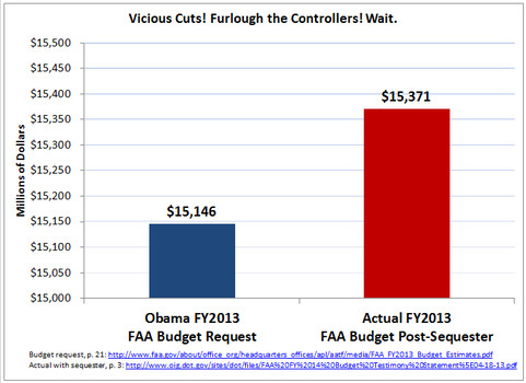
If the FAA indeed got more money than it requested for FY2013 even after the sequester, then it’s reasonable to question why cutting back air traffic controllers is necessary. It’s a really good point.
But the chart gives the illusion that the actual budget is more than twice the requested budget! Below, I copy the blue “request” box and stack it three times next to the red “post-sequester” box.
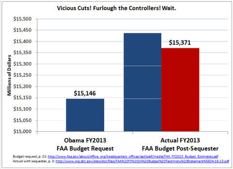
But look at the numbers on top of the boxes: $15,146 million vs $15,371 million. An increase of .015 percent! A rounding error. So, why does it look like an increase of 250 percent? Why, because the X-axis starts at $15 million and is broken up into increments of 50 thousand.


Sheesh, this is one of the most basic things outlined in a book “How to lie with statistics,” that my professor had us read in college. The scaling of the graph is overly dramatized to make the reader think the difference is really huge. It’s PSYOPS 101.
Yes, there are many, many graphs that are constructed to show a particular viewpoint. It’s rather brilliant…if you are the author of the graph. There is some of this in almost every graph….look carefully, you might have missed them previously.
I’ve never seen a graph that was so bad it was good, but this is it. It leaves a cloud on the author.
Of course, this little chart is not the whale in the soup:
I’ve been told that conservatives now understand Krugman’s triumph, but how many of them have really internalized it?
I mean, if the fall of austerian thinking is only causes conservatives to turn away from economic questions … that would be pretty fucking sad.
I guarantee that inflation was more than .015% last year. And I definitely guarantee that even though there was an air traffic slowdown that hasn’t quite recovered, there are more planes in the air this year than last year.
@Console:
The open secret is that there is no one inflation, and when people zig or zag to avoid price increase (cancelling cable tv or whatever) their net change in “utility” varies greatly.
If any of us wants to track “true inflation” we have to do it with our own bundles of goods. For example my Prius means that i am less sensitive to fuel prices, etc
What kind of a moron do you have to be to not realize that the actual dollar amounts are printed, in bold, just above the boxes?
Lamest Blog Post Ever?
@Septimius: So, in your estimation, why is the box for $15,146 million two-and-a-half times as big as the one for $15,371 million?
@James Joyner:
Because the baseline represented on the x-axis starts at $15 billion, not at $0. I suppose he could have used $0 as his baseline. Then, the red box would only be slightly larger than the blue, but the graph would be about 6 feet long.
Seriously, come on!
This isn’t that uncommon, unfortunately. At the least, they should have started the y axis at 0 and inserted a jagged line to indicate to the viewer that a great gap exists. If they intentionally didn’t do that to be deceptive, then it is quite douchey.
@john personna: Until conservatives approach economics from a reality-based perspective, we’re all better off if they stay away from economic questions.